Analyzing the Spatial Mechanics of Ratio Compression
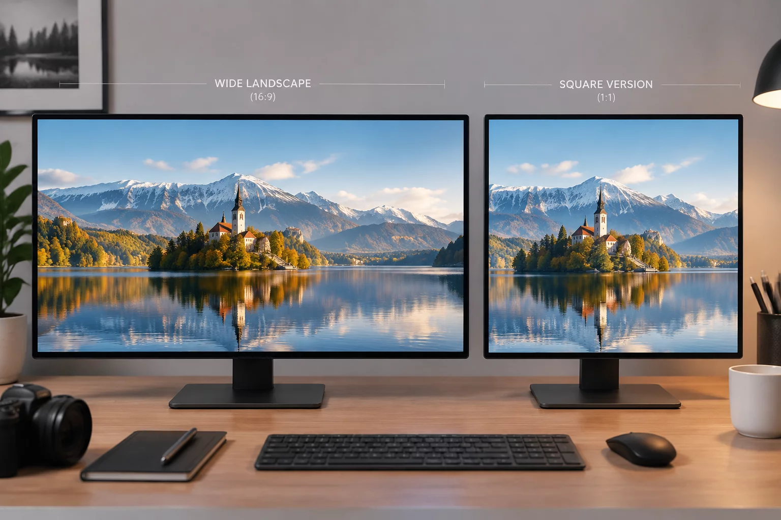
Transforming an expansive horizontal composition into a compact 1:1 canvas requires far more than mere center-cropping or aggressive border trimming.
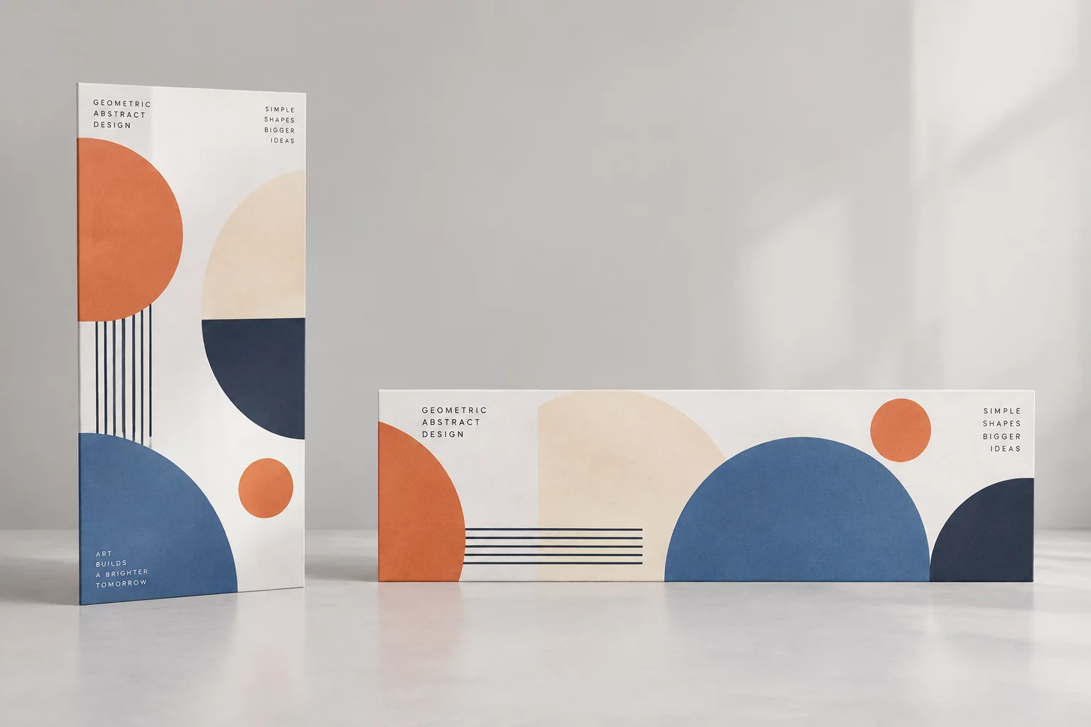
Panoramic and widescreen formats naturally distribute visual information across wide lateral sightlines. Viewers scan horizontally, taking in supporting environmental context alongside primary subjects. When shifting into a square format, lateral breathing room vanishes, forcing key visual weights into a tighter gravitational field.
Designers frequently encounter the dilemma of lost atmospheric context. By identifying the primary focal anchor and establishing vertical layering instead of lateral dispersal, the original visual tension remains active and purposeful.
Four Strategic Steps to Rebalance the Canvas
Successful format conversion balances compositional hierarchy by executing a sequence of structural adjustments:
- Isolate the primary focal anchor and reposition secondary context elements vertically above or below rather than horizontally.
- Recalibrate white space and margins to prevent edge-crowding and optical distortion along tighter borders.
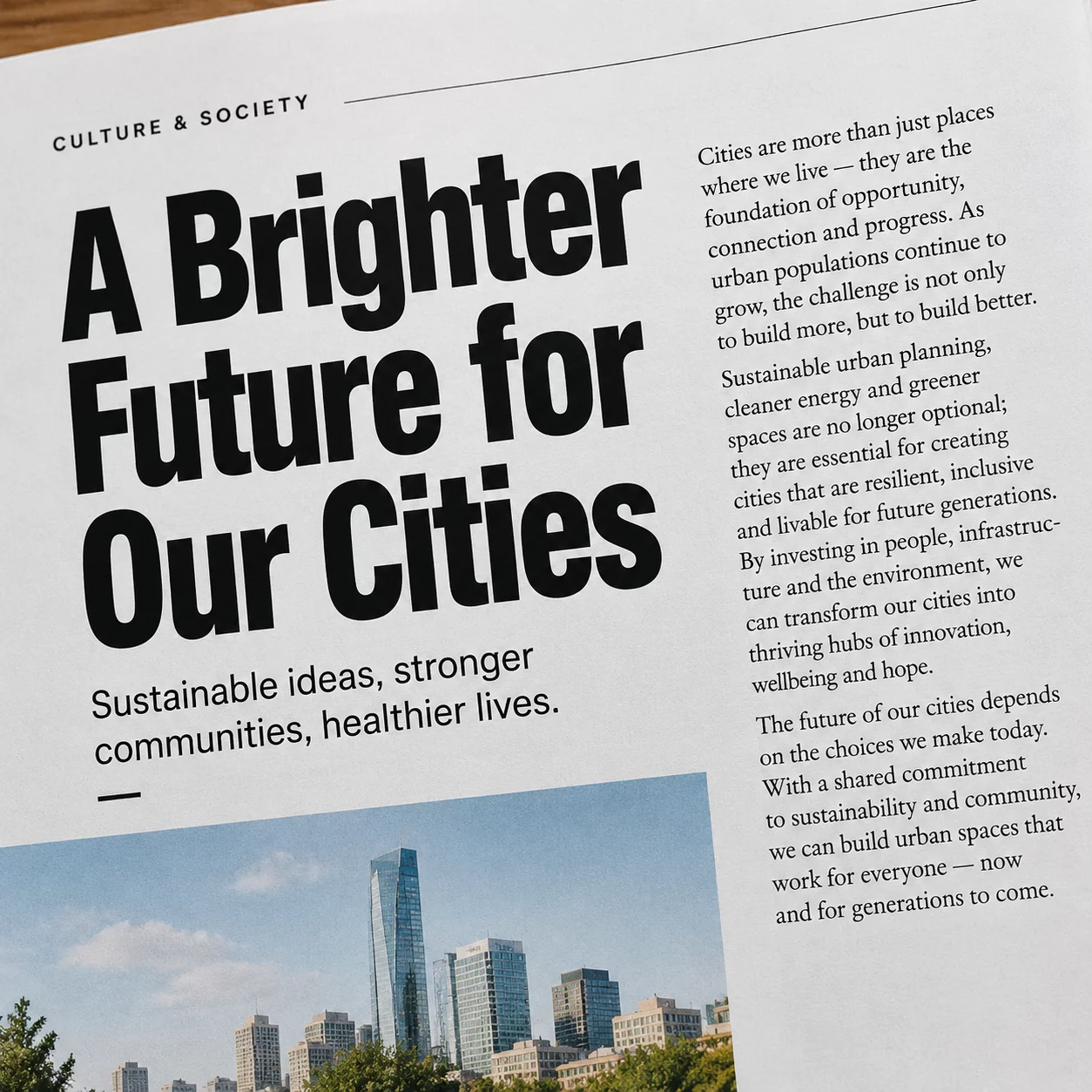
- Re-stack multi-column typographic blocks into compact, high-contrast vertical clusters.
- Extend or blend ambient background textures to fill vertical canvas space naturally without stretching visual assets.
Applying these adjustments methodically ensures that the square rendition carries the exact emotional impact and brand recognition of its widescreen predecessor.
Format Adaptation Specifications & Rules
| Primary Aspect Ratio Transition | 16:9 (1920×1080) to 1:1 (1080×1080) |
|---|---|
| Typographic Density Shift | Horizontal 2-line header to 3-line centered or left-stacked block |
| Margin & Safe Zone Standard | 8% inner perimeter boundary margin for optimal social viewport framing |
| Focal Layer Hierarchy | Single dominant visual anchor (60% canvas area) with vertically stacked metadata |
Adhering to these strict proportions protects critical messaging across varying screen densities and prevents vital campaign elements from getting cropped in thumbnail feeds.
Master Multi-Format Layout Transformation
Need Custom Composition Adaptation for Your Campaign?
Collaborate with FormatRelay specialists to build scalable design rulebooks and automated format toolkits tailored to your brand assets.
Request a Format Adaptation Assessment
Share your design files and format conversion requirements to receive a structured technical hierarchy plan.
Related Format Transformation Studies