Deconstructing the Master Key Visual for Multi-Channel Scale

Multi-platform advertising rarely grants the luxury of a uniform canvas. A creative direction that lands powerfully on a tall smartphone screen often disintegrates when stretched across a landscape desktop banner or compressed inside a square grid feed.
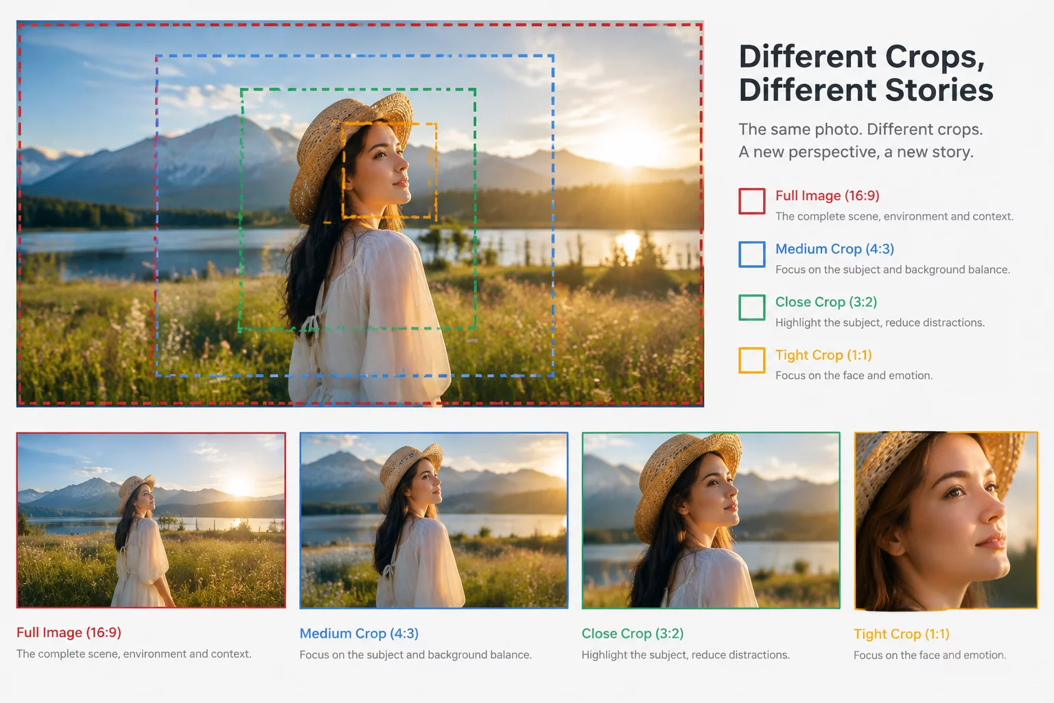
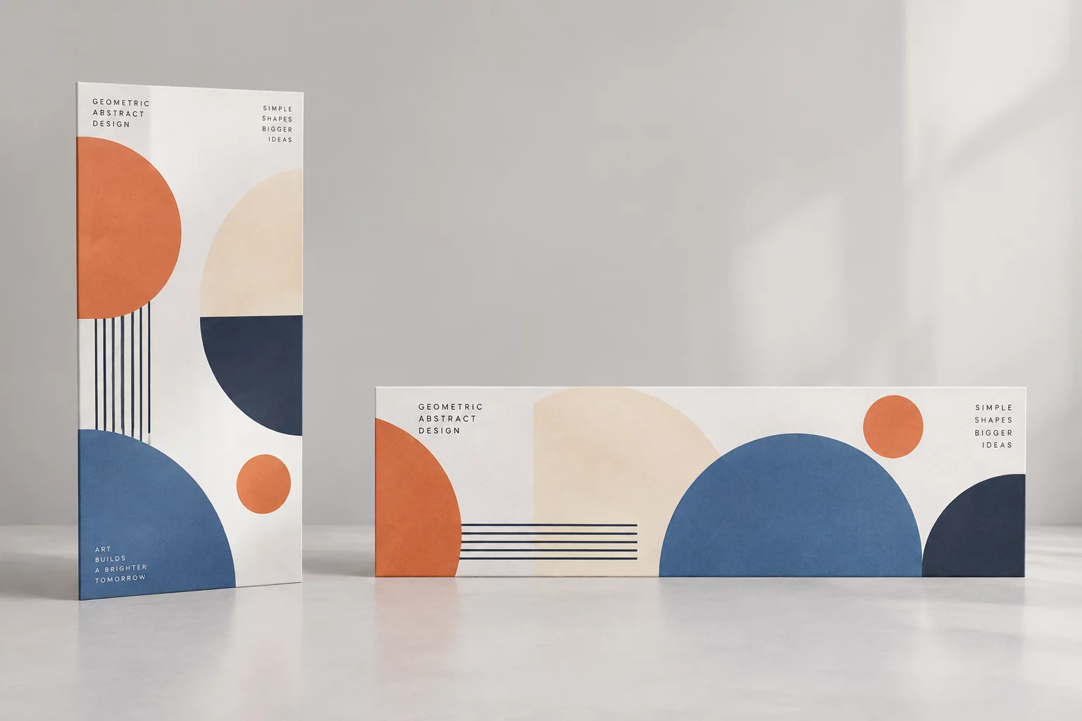
Translating one master concept into four contrasting formats begins by isolating the essential building blocks: the anchor graphic, the primary headline, supporting metadata, and negative space. When designers treat these components as modular assets rather than a single flattened image, restructuring each layout becomes an intentional design decision rather than a reactive crop.
Vertical layouts demand vertical pacing where the viewer absorbs the headline first before resting on the imagery below. Wide horizontal placements split attention across left and right axes, requiring distinct horizontal zoning. By treating each aspect ratio as a unique conversational pace, the campaign delivers unified recognition across all physical and digital channels.
Structural Rules Across Four Primary Ratios
Each format imposes its own geometric boundaries and viewing habits. Applying rigid scaling equations ruins hierarchy; instead, use four distinct layout tactics tailored to each format's strengths:
- Vertical 9:16 Canvas: Position high-impact typography in the top-third zone, giving the central subject ample room while safeguarding bottom margins against interface overlays.
- Horizontal 16:9 Banner: Organize the artboard into distinct asymmetrical halves, anchoring primary copy on one side and the visual subject on the other with generous negative space.
- Square 1:1 Social Frame: Consolidate focal weight into a balanced, tight perimeter where typography and key visual interact directly without border crowding.
- Portrait 4:5 Editorial Card: Stack secondary information neatly below bold headlines, utilizing natural editorial scanning patterns for maximum readability.
Documenting these exact rules in a campaign handoff sheet guarantees that junior designers, media buyers, and external production partners generate harmonious adaptations across every media tier.
Asset Specifications and Proportional Grid Matrix
| Ratio Dimensions | 1080x1920 (9:16), 1920x1080 (16:9), 1080x1080 (1:1), 1080x1350 (4:5) |
|---|---|
| Type Scaling System | Fluid modular scale adjusted dynamically per canvas width and safe-zone limits |
| Subject Preparation | Isolated cutout layers with minimum 20% background bleed extension for multi-format shifting |
| Safe Zone Tolerance | Minimum 150px top and bottom clearance on vertical formats to prevent app UI occlusion |
Adhering to these strict dimensional guidelines prevents last-minute stretching, pixelation, and awkward cropping during high-tempo marketing rollouts.
Format Advisory & Campaign Production Review
Struggling to Scale Your Campaign Creatives?
Get direct feedback on your key visual assets and learn how to optimize proportions across all channels.
Schedule a Campaign Format Consultation
Share your campaign details and target aspect ratios. Our design mentors will review your composition workflow.
Related Composition Guides