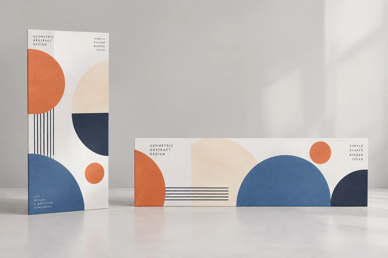
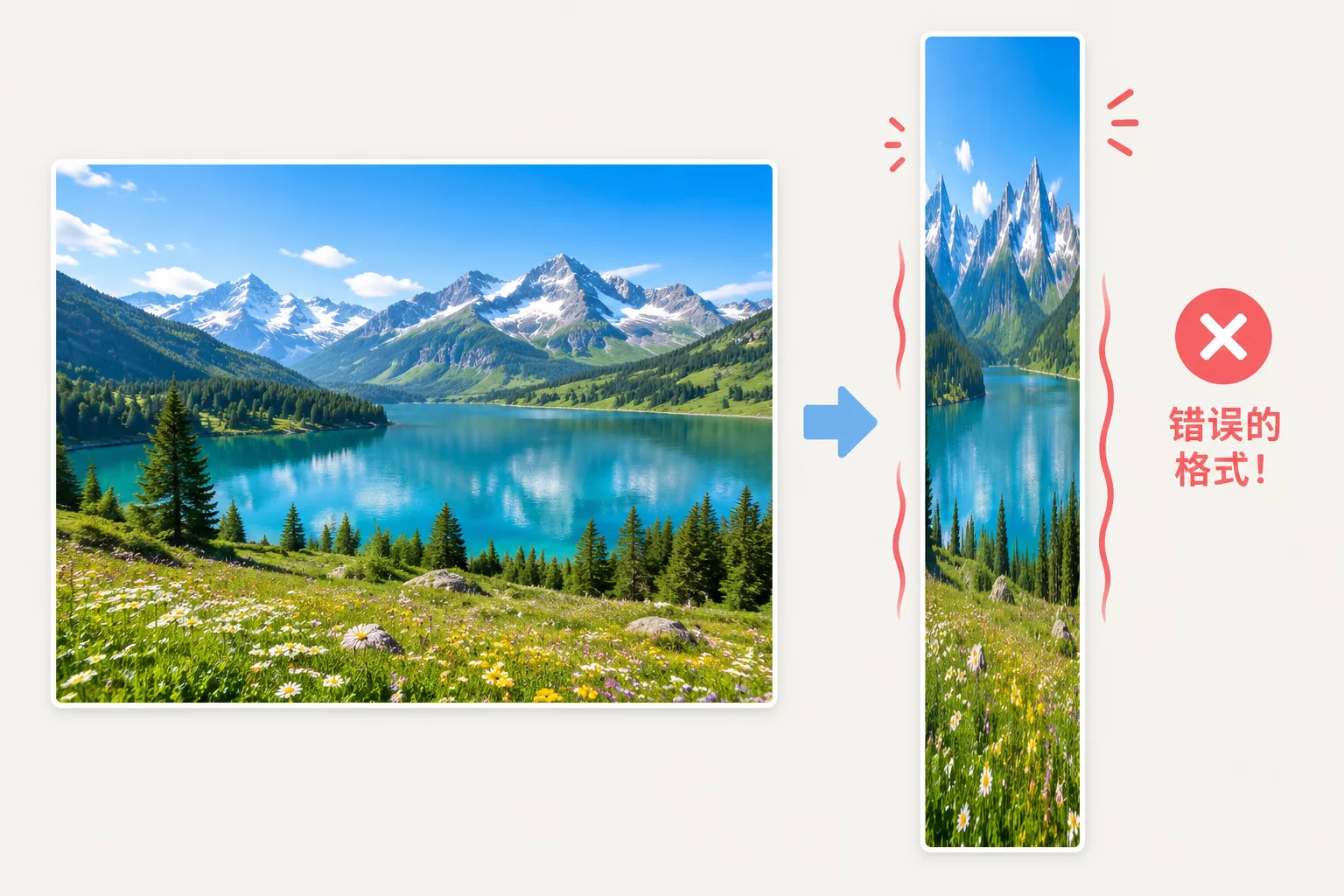
The Optical Paradox of Uniform Type Downscaling

Scaling down an entire typographic layout proportionally never yields a legible or balanced result on compact formats.
When high-impact poster or wide desktop compositions are compressed by a static percentage into small cards or smartphone screens, delicate display serifs vanish and microcopy becomes unreadable. Optical perception behaves differently across scale boundaries; subtle hairline strokes and tight negative spaces close up entirely under lower pixel densities and smaller physical measurements.
A resilient adaptation strategy decouples structural hierarchy from direct geometric scaling. By recalibrating letter tracking, opening up counters, and adjusting line-height relative to line length, designers retain the distinct voice of the original composition without sacrificing effortless scanning.
Practical Adjustments for Compact Typographic Systems
When restructuring editorial content for smaller design surfaces, five core typographic variables require targeted adjustments:
- Expand character tracking by +2% to +5% on body copy and captions to prevent glyph crowding.
- Flatten modular scale steps from dramatic ratios (1.333 or 1.414) down to tighter progressions (1.125 or 1.200).
- Swap ultra-thin display cuts for medium or semibold optical weights with reinforced serifs and open apertures.
- Shorten line length to 35-50 characters per line, preventing eye fatigue across narrow column measures.
These deliberate modifications preserve strong visual contrast between primary titles and supporting information, ensuring the core message registers instantly during brief glance interactions.
Scale Comparison Matrix: Large versus Compact Canvases
| Headline Size & Line Height | Compacts from 48px/56px to 22px/28px with tightened letter-spacing |
|---|---|
| Body Text Legibility Baseline | Adjusted from 16px/24px to 14px/20px with slightly expanded letter tracking |
| Typographic Hierarchy Ratio | Reduced from 3.0:1 dual-tier scale to a condensed 1.6:1 functional range |
| Recommended Column Measure | Optimized between 32 and 45 characters per line to eliminate awkward wrapping |
Establishing these concrete proportional parameters enables production teams to generate consistent multi-channel promotional batches without unpredictable layout reflows or broken alignments.
Request a Multi-Format Typographic Review
Auditing Multi-Scale Design Assets?
Get personalized recommendations on responsive font stacks, tracking calibration, and modular scale refactoring for your creative campaigns.
Schedule a Typographic Scaling Consultation
Fill out the project details below to review your layout adaptation constraints with our workshop team.
Related Adaptation Guides