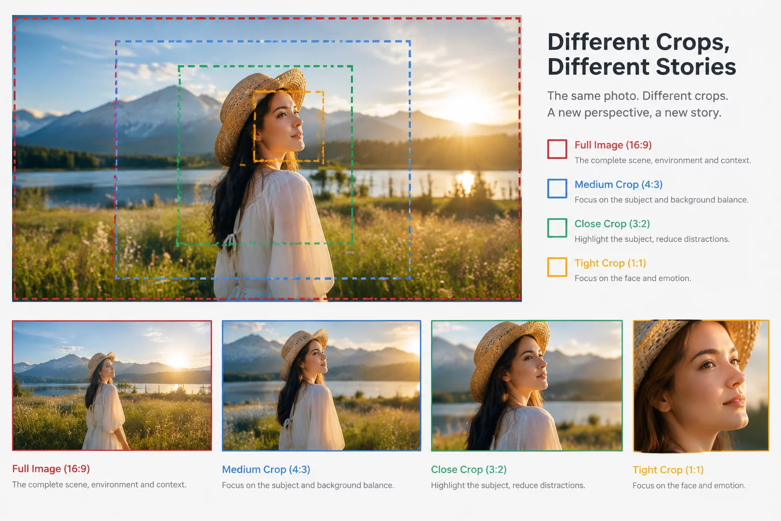
The Fallacy of the Universal Crop

A master visual created for a widescreen landscape orientation quickly collapses when squeezed into a vertical story or square post container without careful structural rethinking.
Visual designers frequently face production briefs demanding that a single hero illustration or product photo seamlessly occupy web billboards, printed upright posters, square social cards, and vertical mobile feeds. Mechanical auto-cropping or center-slicing destroys the visual story because secondary narrative elements get eliminated while primary subjects lose their surrounding negative space.
Instead of stretching textures or adding artificial gradient letterboxing, professional workflows decompose master visuals into modular layers. Isolating subjects, ambient backgrounds, and graphic accents allows designers to reposition primary focal points specifically for each canvas ratio without introducing distortion.
Core Bottlenecks When Shifting Proportions
Before initiating automated resize actions or manually hacking artboards, evaluate the key visual friction zones that emerge during radical aspect shifts:
- Displaced Eye-Flow: Horizontal scanning patterns fall apart when the composition is constrained to a tall, vertical corridor.
- Negative Space Starvation: Tight crops around hero objects leave zero breathing room for supporting typography, badges, or calls-to-action.
- Distorted Perspective Lines: Background horizon lines and vanishing points feel unnaturally severed when cropped off-center.
- Scale Incoherence: Intricate micro-details that look stunning on desktop screens turn into unrecognizable visual noise on compact mobile feeds.
Recognizing these constraints early transforms asset scaling from a destructive slicing task into an intentional recomposition process.
Recommended Asset Adaptation Matrix
| Modular Layering | Separate key subjects onto transparent PNG/Alpha channels with extendable matte backdrops |
|---|---|
| Canvas Groupings | Landscape (16:9, 21:9), Centered (1:1, 4:5), and Vertical (9:16, 2:3) layout clusters |
| Focal Realignment | Reposition subjects along vertical thirds rather than locking to geometric center |
| Copy Zone Buffer | Reserve an isolated 25% minimum clean space dedicated strictly to contextual typography |
Applying this structured adaptation matrix guarantees that every promotional format presents an intentional, tailor-made visual identity that elevates the overarching brand narrative.
Schedule an Asset Strategy Consultation
Facing Multi-Format Composition Challenges?
Our workshop specialists help creative departments audit image pipelines and build robust modular visual frameworks for complex omnichannel campaigns.
Campaign Asset Review
Share your campaign details and current format friction points to receive practical compositional recommendations from our instructors.
Related Adaptation Guides