Deconstructing the Vertical Canvas Before Adaptation
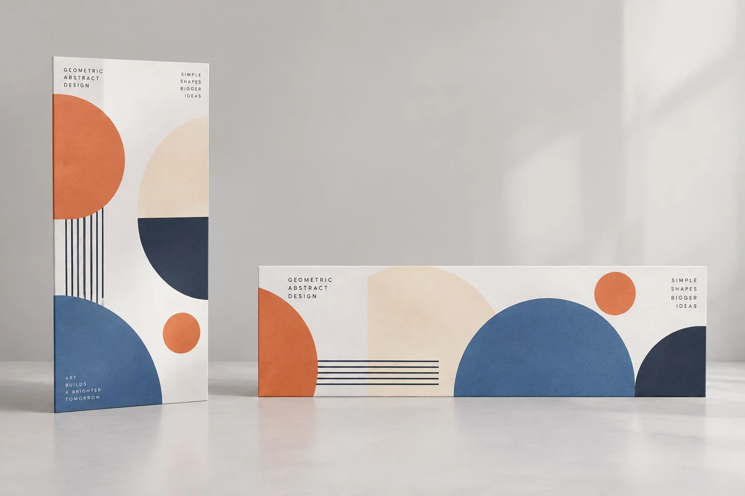
Moving from a vertical poster to a wide horizontal banner requires dismantling the original top-to-bottom hierarchy and redistributing visual elements across a lateral axis.
In standard portrait layouts like 4:5 posters or 9:16 digital screens, the viewer's gaze follows an intuitive vertical cascade. The primary headline commands the upper register, the visual centerpiece anchors the middle frame, and event data or conversion triggers sit near the bottom edge. When forced into a wide horizontal banner without intentional redesign, this stacked order collapses, resulting in cramped typography, cropped imagery, and awkward negative voids.
A systematic workflow isolates the hero artwork, measures available margins, and separates text blocks into distinct modular components. Designers can then establish an asymmetrical balance where graphic elements occupy one side of the canvas while multi-tier typography balances the composition on the opposite side.
Key Recomposition Principles for Wide Canvases
Transforming layout orientation requires following four practical steps to guarantee balanced contrast and legibility across wide screen displays:
- Separate focal zones: place the key subject on one flank while keeping typographic clusters cleanly aligned on the opposite side.
- Extend background environments naturally with contextual gradients, textured cloning, or generative fills instead of geometric scaling.
- Restructure typography into horizontal lockups, converting single long lines into balanced two-tier blocks with distinct weights.
- Preserve vital margin buffers around calls-to-action and partner logos to avoid visual friction near display borders.
Following these structural guidelines guarantees that the final banner retains the brand character and emotional appeal of the original poster while delivering rapid readability on desktop and digital billboard placements.
Format Transformation Technical Matrix
| Aspect Ratio Shift | Vertical (4:5 / 2:3) converted to Horizontal (16:9 / 1200×628 / 3:1) |
|---|---|
| Hero Subject Placement | Anchored to golden ratio third with 35% lateral frame occupancy |
| Typographic Restructuring | Vertical stack transformed into dual-column header and action cluster |
| Background Extension | Directional feathering and matched ambient fill across extended zones |
Establishing clear technical standards across ratio shifts ensures that design teams produce consistent multi-format outputs rapidly, preventing arbitrary adjustments during tight campaign deadlines.
Campaign Adaptation Consultation
Need Scalable Multi-Format Master Templates?
Get personalized layout guidance from our instructors to streamline your cross-media campaign delivery.
Schedule a Format Consultation
Submit your project requirements and let our design specialists evaluate your visual asset ratios.
Further Format Resources