Curatorial Vision and Media Fragmentation Challenge
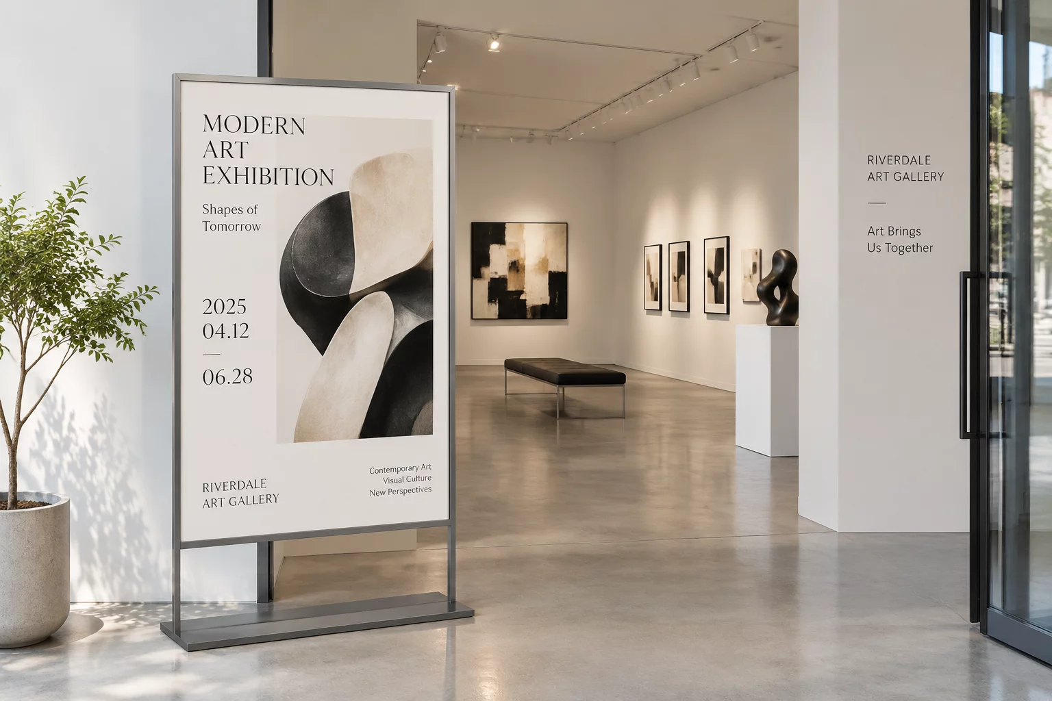
The curatorial team at the contemporary art center needed a unified design strategy for an upcoming seasonal retrospective.
Traditional fine art gallery promotion emphasizes generous white margins, delicate serif typefaces, and high-fidelity artwork reproductions. When this material must transition beyond static gallery entrances into horizontal outdoor digital kiosks and square digital feeds, traditional design approaches frequently compromise curatorial subtlety.
Without an intentional adaptation framework, either the featured artwork suffers from aggressive cropping or the vital details like exhibition dates, visiting hours, and artist talks become unreadable. Our project focused on systematically restructuring the core composition so that every collateral piece preserved the quiet dignity of the original artwork while remaining immediately functional across physical and digital formats.
Strategic Layout & Proportional Adaptation System
To preserve visual hierarchy without producing cluttered layouts, the design team established four compositional guidelines:
- Dynamic negative space anchoring that prevents typography from encroaching on delicate artwork focal zones.
- Responsive typographic scaling calibrated specifically for exhibition headings, curatorial essays, and admission dates.
- Color-matched edge extensions that prevent abrupt artwork cutoffs in wide horizontal outdoor banners.
- High-contrast micro-typography guaranteeing sharp legibility for sponsor credits across smartphone screens.
Testing these adjustments across varied display dimensions ensured the visual identity remained distinctly recognizable, whether spotted from across a city boulevard or scrolled past on a compact feed.
Technical Specifications & Format Output Matrix
| Primary Print Medium | A1 Museum Street Posters (594 × 841 mm) & Gallery Vinyl Banners |
|---|---|
| Digital Ratio Suite | 1:1 Square Feed Tiles, 9:16 Vertical Stories, 16:9 Wayfinding Displays |
| Typographic Hierarchy | Vollkorn Serif Display (Headings) + Clean Geometric Sans (Event Data) |
| Color Management | Dual CMYK FOGRA39 Print Profile + Rec. 709 / sRGB Web Calibration |
The resulting collateral matrix delivered eighteen modular layout assets. Every adaptation protects original artwork proportions and aesthetic restraint while honoring the mechanical limitations of print presses and illuminated screens.
Launch Your Campaign Adaptation Consultation
Need Help Adapting Complex Visual Identities?
Our format specialists work with curators, cultural institutions, and creative agencies to protect original artwork balance across varied promotional dimensions.
Request an Exhibition Format Strategy Session
Fill out the form below with your current artwork ratios and output requirements. Our design team will review your collateral specifications.
Related Case Studies in Format Adaptation