The Challenge of Radical Proportional Transition
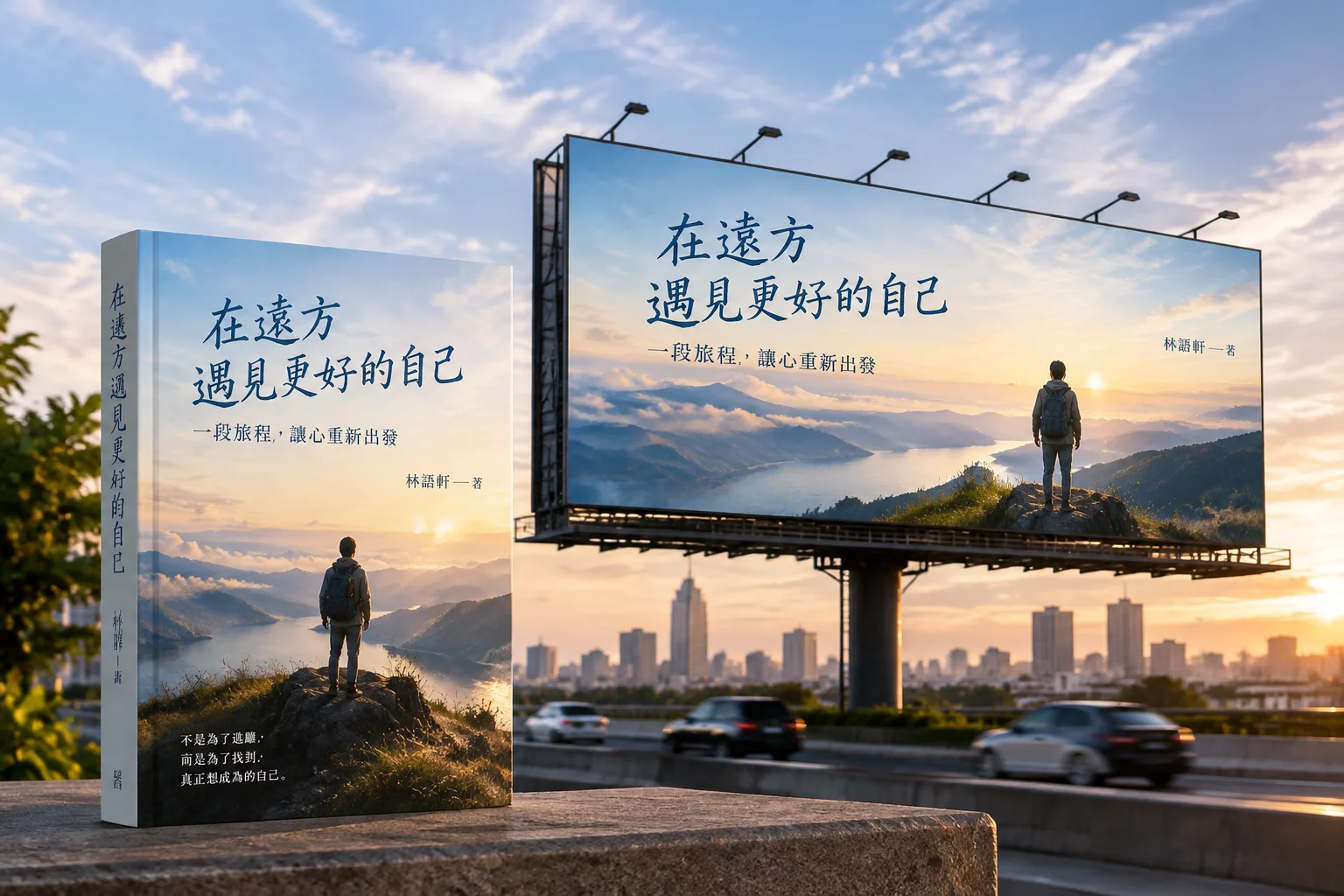
Scaling an artwork designed for hand-held inspection to an immense outdoor installation demands more than simple vector enlargement.
The original book cover relied heavily on stacked serif typography, subtle debossed foil accents, and an intimate focal illustration framed by narrow margins. When the publisher decided on an extensive metropolitan highway billboard campaign, the immediate impulse was simply to center the book jacket on a plain color field. That default approach resulted in massive dead space and diminished viewing distance legibility for drivers traveling at 60 mph.
The project required decomposing the primary narrative elements and rebuilding the visual hierarchy from the ground up. By uncoupling the author signature, main title lettering, and central illustration, our team orchestrated a horizontal reading trajectory that guides the viewer's eye across the billboard within a three-second perceptual window.
Core Structural Steps and Adaptations
Transitioning from close-up tactile print to roadside grand format required four distinct compositional maneuvers:
- Deconstructed the vertical composition into modular foreground, atmospheric midground, and infinite background layers.
- Re-proportioned the custom serif title lettering to increase counter spaces and stroke weights for instant distance legibility.
- Extended background scenery horizontally using digital matte painting techniques to prevent artificial hard cropping.
- Reorganized metadata, placing the publication date and bestseller callout into high-contrast peripheral focal anchors.
These decisive layout shifts ensured that neither the emotional depth of the story nor the commercial potency of the author's brand were diluted during the extreme scale magnification.
Technical Specifications & Execution Matrix
| Source Dimensions & Resolution | 6 × 9 inches @ 300 DPI (CMYK Coated FOGRA39) |
|---|---|
| Target Billboard Format | 48 × 14 feet (14.6 × 4.3 meters) Outdoor Vinyl @ 30 DPI |
| Perceptual Reading Window | 2.8 to 3.5 seconds at 55–70 mph vehicle velocity |
| Typographic Contrast Gain | +35% heavier baseline stems, widened kerning pairs |
By calibrating contrast ratios and stroke thickness against outdoor ambient sunlight conditions, the billboard achieved 100% recognition rating across driver focus group simulations.
Consultation & Format Strategy
Have a Publication or Print Campaign to Scale?
Book an expert review session to determine how your print or digital assets can seamlessly migrate to out-of-home media.
Schedule Your Format Adaptation Review
Submit your source dimensions and target placement requirements for practical layout feedback.
Related Case Studies