The Cross-Channel Proportions Challenge

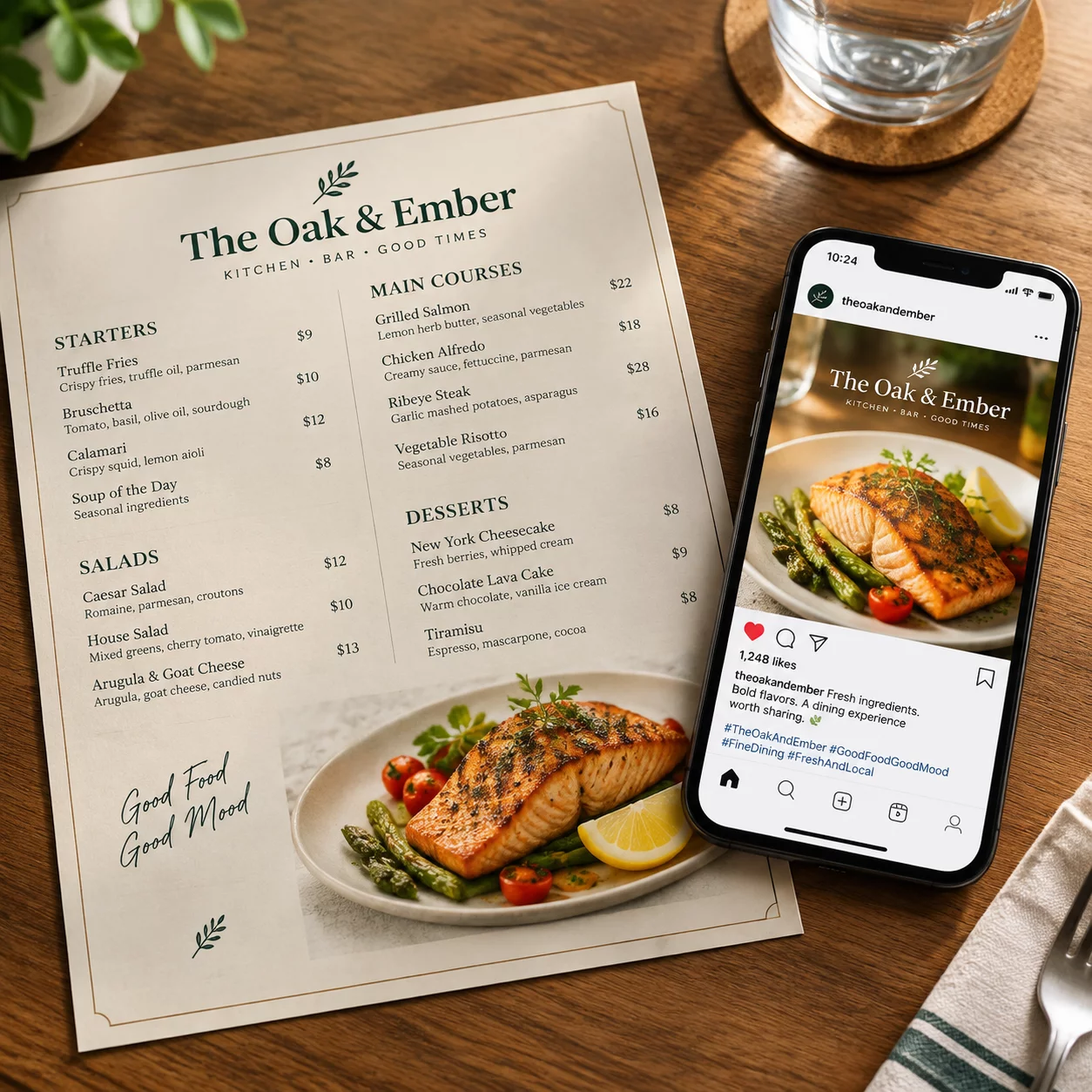
When seasonal promotional assets scale across digital storefronts, social platforms, and high-impact email blasts, mismatched cropping frequently hides key product details or crowds critical typography.
In this retail campaign, the primary merchandise shot contained complex textures and directional lighting that required substantial breathing room. Placing fixed typography over unpredictable dynamic crops created visual friction on compact mobile screens, while wide desktop hero placements diluted focal tension.
The team established a modular asset framework where product silhouettes, call-to-action badges, and promotional headers reposition themselves along predefined grid anchors rather than relying on automated center-crop compression.
Layout Strategy and Focal Balance
Adapting e-commerce graphics across diverse screen sizes requires respecting safe margin boundaries, headline contrast thresholds, and instantaneous visual hierarchy:
- Isolation of the primary product anchor to ensure instant recognition within the initial 0.3 seconds of viewer glance.
- Dynamic repositioning of promotional discount badges to prevent overlap with standard e-commerce UI navigation elements.
- Optical typographic scaling that guarantees headline legibility on mobile viewports while preventing visual bloat on wide monitors.
- Calibrated negative space reserves across wide landscape formats to balance visual weight against peripheral browser margins.
By standardizing these rules prior to production, our workshop eliminated ad-hoc adjustments and ensured that every format maintained uniform brand authority.
Asset Adaptation Specifications
| Primary Hero Banner (Desktop) | 1920×600 px (3.2:1) — Horizontal anchor, offset typographic container, left-aligned call-to-action. |
|---|---|
| Social Feed & Catalog Square | 1080×1080 px (1:1) — Centered product hierarchy, compact badge clustering, top-anchored title. |
| Vertical Story & Reels Canvas | 1080×1920 px (9:16) — Multi-tier vertical stacking with dedicated top and bottom UI safe zones. |
| Targeted Retargeting Placements | 300×250 px & 728×90 px — High-contrast micro-copy with simplified single-focal-point composition. |
Establishing precise pixel-level boundaries and clear hierarchical rules across all screen formats allowed the retail team to cut campaign asset rollout timelines by more than half while elevating click-through consistency.
Multi-Format Production Support
Need tailored asset adaptation frameworks for your next launch?
We structure multi-ratio design guidelines, typographic scaling standards, and responsive layout libraries for high-velocity marketing and design teams.
Discuss Your Multi-Format Campaign Needs
Submit your campaign parameters to receive direct guidance on modular layout architecture, focal preservation, and asset distribution workflows.
Related Adaptation Case Studies