Campaign Scope & Composition Challenges
Non-profit initiatives face a unique design challenge: conveying urgent social needs while maintaining emotional warmth across wildly differing media formats.
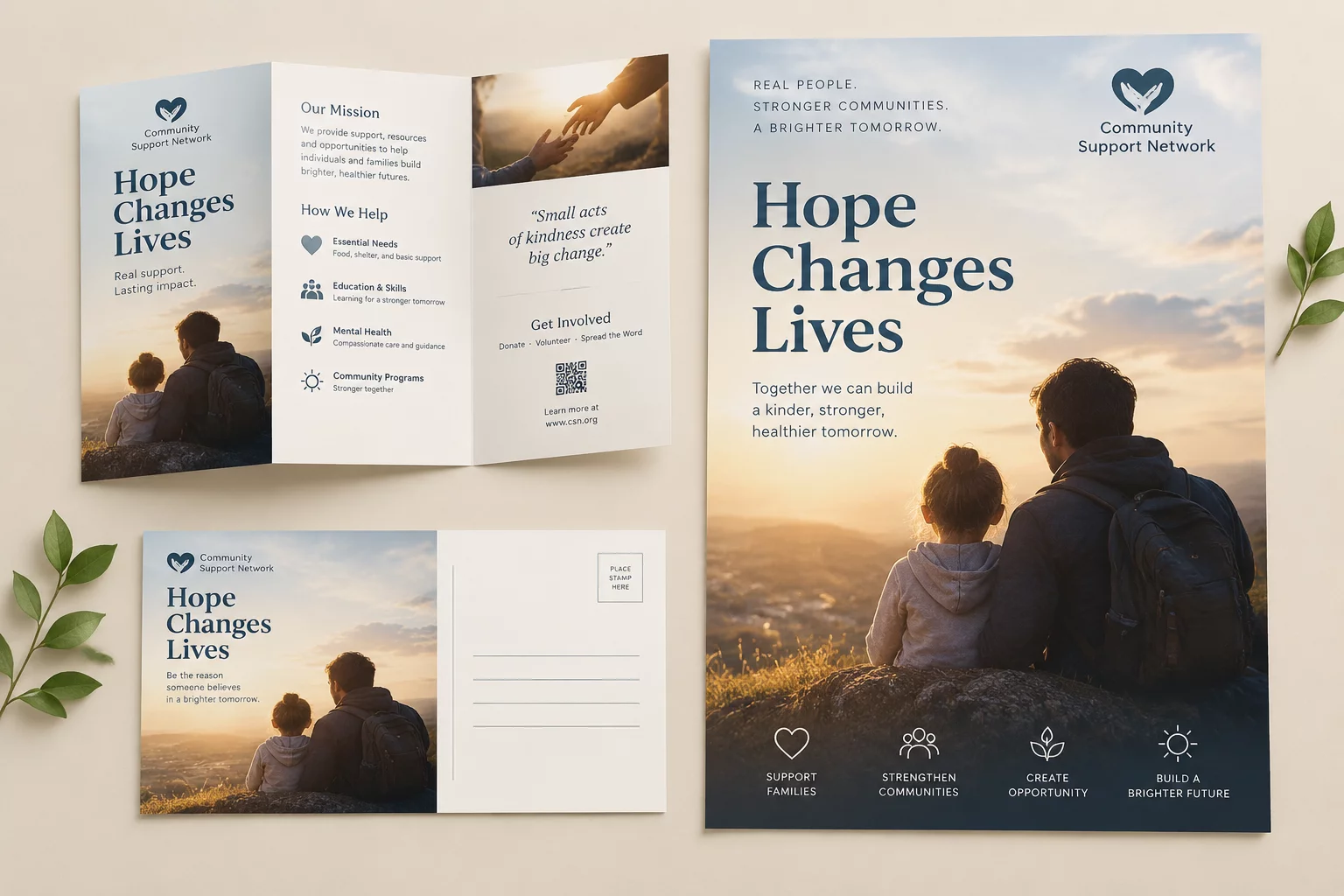
The original campaign artwork originated as an A1 community poster featuring powerful documentary photography paired with dense statistical callouts and a primary donation prompt. When local organizers needed to extend this campaign to horizontal transit shelters, postcard mailers, and square digital feeds, direct cropping caused critical elements to clash or disappear entirely.
Our workshop established a systematic reformatting workflow. Rather than shrinking the vertical artwork into smaller frames, we broke the master design into modular visual zones. This allowed the human focal point, key impact figures, and call-to-action blocks to reorganize dynamically according to each canvas aspect ratio.
Strategic Adaptation Methodology
To ensure total visual consistency and message retention across every physical and digital touchpoint, we implemented four core structural rules:
- Modular Copy Containers: Headlines, body copy, and donation URLs were separated into independent typographic clusters that reposition without obscuring imagery.
- Protected Subject Boundaries: Safe zones around facial expressions ensured authentic human connection remained the undisputed focal point on both mobile feeds and billboards.
- Dynamic Call-to-Action Anchoring: Physical print versions incorporated clear high-contrast QR code modules, which converted smoothly to solid button UI in digital formats.
- Calibrated Color Contrast: A warm community palette was balanced against dark navy text blocks to maintain WCAG-compliant legibility in varied ambient lighting.
These adaptation protocols allowed regional volunteers and marketing teams to produce on-brand variations within minutes, eliminating disjointed visual messaging across distribution points.
Format Specifications & Production Matrix
| Primary Master Format | A1 Vertical Print Poster (594 × 841 mm, 300 DPI CMYK) |
|---|---|
| Digital Social Deliverables | 1:1 Feed Post (1080 × 1080 px), 4:5 Carousel, 9:16 Story Frame |
| Transit & Out-of-Home | 16:9 Digital Bus Shelter Display & 3:1 Street Horizontal Banner |
| Direct Mail & Editorial | DL Tri-Fold Brochure & A5 Informational Postcard Inserts |
By defining explicit rules for typography scale ratios and margin padding beforehand, the design team avoided repetitive micro-adjustments and delivered a cohesive, high-impact campaign ecosystem ready for immediate deployment.
Campaign Format Strategy Consultation
Ready to Scale Your Non-Profit Campaign Assets?
Request a direct layout evaluation to learn how your core visuals can transition seamlessly across print collateral, donor reports, and digital social media.
Schedule a Design Architecture Review
Fill out your project specifications to receive concrete layout transition guidelines tailored to your team.
Related Multi-Format Case Studies