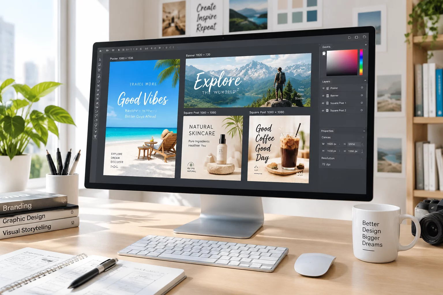
 Layout Relay
One Campaign, Four Different Formats
Discover how to construct an anchor visual system that flexes smoothly into print posters, web banners, and square social units without losing brand recognition.
Explore practical design examples about adapting compositions, images, typography, and visual elements for print and digital communication.
FormatRelay Workshop is an independent educational website about adapting a single visual idea for multiple advertising, informational, and editorial formats. Where a conventional approach focuses on perceiving an isolated layout, this project addresses a different challenge: preserving the recognizability of a design solution while sizes, proportions, and usage conditions change.
For example, a small art gallery preparing an exhibition announcement needs a printed poster, a horizontal banner, a square publication, and a compact information card. Simply scaling the original image does not solve the problem: elements become too small, proportions shift, and part of the information is lost. FormatRelay examines this problem through the sequential transformation of a composition — the core mechanic is Format Relay. Every publication starts from the original visual solution and shows which changes are required for each subsequent format. The site provides educational examples, not automatic image-adaptation tools.
Who This Site Is For
Transforming a solitary artistic concept into a cohesive multi-channel campaign requires purposeful compositional reframing rather than crude scaling. Explore our step-by-step adaptation mechanics.
Every layout begins with a singular graphic anchor—a dominant subject, distinctive color harmony, and a clear typographic hierarchy. Before creating derivative versions, designers isolate which elements are indispensable to the core identity.
High contrast center that survives multiple re-proportions.
Physical media imposes hard physical constraints: physical bleed margins, crop lines, and viewing distance requirements. A large-format exhibition poster demands generous white space and bold contrast that carries across a physical hall.
Digital environments range from vertical mobile viewports (9:16) to ultra-wide desktop banners (16:9). Critical compositional elements must steer clear of native interface overlays, navigation bars, and dynamic status bars.
UI overlays avoided through designated safe margins
Blind cropping frequently lops off context or distorts proportions. FormatRelay uses intelligent re-composition: shifting key subjects along the rule-of-thirds grid, expanding negative backdrops, or segmenting hero elements into layered cutouts.
Focal anchor remains intact while outer layout breathes
Shifting from an upright poster to a wide web leaderboard requires a split-zone methodology: the visual anchor shifts to one flank while typographical hierarchies re-stack horizontally without losing reading flow.
Linear horizontal reading replaces centered vertical stacking
A collection of materials is only as potent as its shared visual thread. By standardizing color palettes, font pairings, corner radii, and contrast ratios, every adapted collateral piece instantly communicates membership in the same project.
Deterministic design rules guarantee universal coherence
The culmination of Format Relay is a complete, production-ready asset pack where street posters, digital promotions, invitations, and horizontal web headers speak with one harmonic visual voice.
Print posters, digital social tiles, web banners, and editorial cards.

Observe how an avant-garde gallery exhibition poster was systematically re-architected across four formats while retaining its original typographic soul and artistic intrigue.
An art gallery is preparing promotional materials for a new exhibition. The initial composition is created for a vertical poster, but the gallery also needs materials for the website and social networks.
Arts & Culture Edition
Directly scaling down an A2 vertical art poster collapses crucial exhibition metadata and clips typographic tension. Instead of destructive stretching, the Format Relay methodology re-orchestrates focal artwork, title anchors, and scheduling coordinates across every distribution touchpoint.
Select a format below to inspect how typographic and visual hierarchy dynamically shifts.
Vertical 3:4 (A2 Print Canvas)
Top-heavy editorial title with ample vertical tracking
Full artistic canvas with central gravity
Establish the primary visual motif and color tone
Horizontal 16:9 (1920 × 1080px)
Shifted to left 50% with high-contrast dates
Artwork anchored on the right third to avoid text overlap
Ensure instant headline readability above the digital fold
Square 1:1 (1080 × 1080px Feed)
Condensed headline badge with high-contrast pill
Tight central framing focused on key artwork detail
Stand out in fast mobile scrolling feeds without clutter
Pocket 2:3 (A6 Physical Handout)
Maximum optical legibility for gallery hours & entry
Top half artwork slice with solid clean base for copy
Provide visitors with a tactile, keepsake reference
Explore systematic approaches to compositional adaptation, cross-media hierarchy, and proportion engineering across real-world design formats.
Layout Relay
Discover how to construct an anchor visual system that flexes smoothly into print posters, web banners, and square social units without losing brand recognition.
 Cropping Dynamics
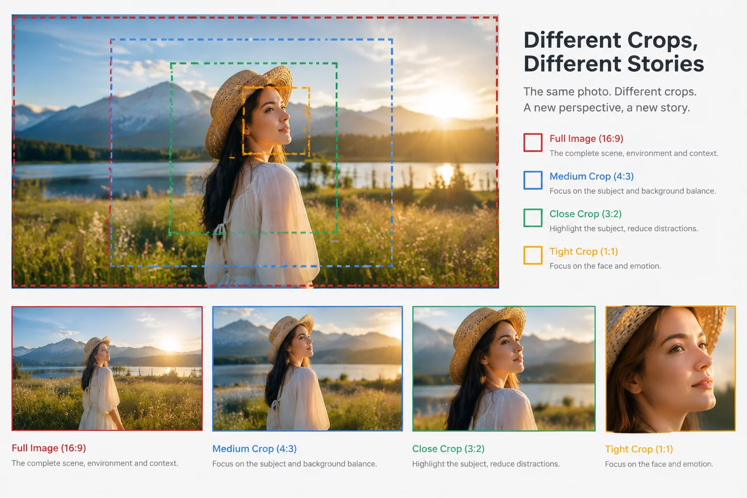
Learn how tight crops refocus narrative emphasis and why automated center-crops often undermine the communicative objective of primary images.
 Proportions
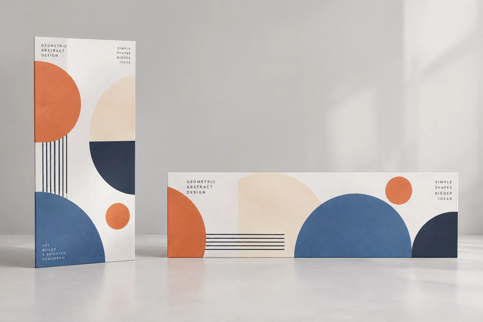
A step-by-step breakdown of reframing vertical editorial compositions for wide horizontal digital spaces while retaining essential rhythm.
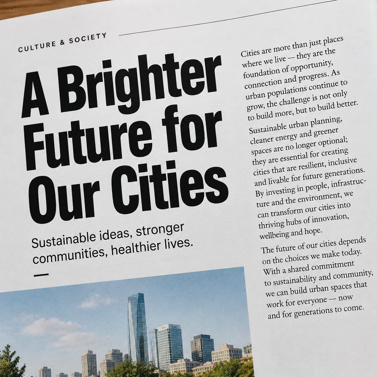 Typography
Techniques for maintaining editorial weight, tracking, and optical clarity when transitioning display titles into compact promo cards.
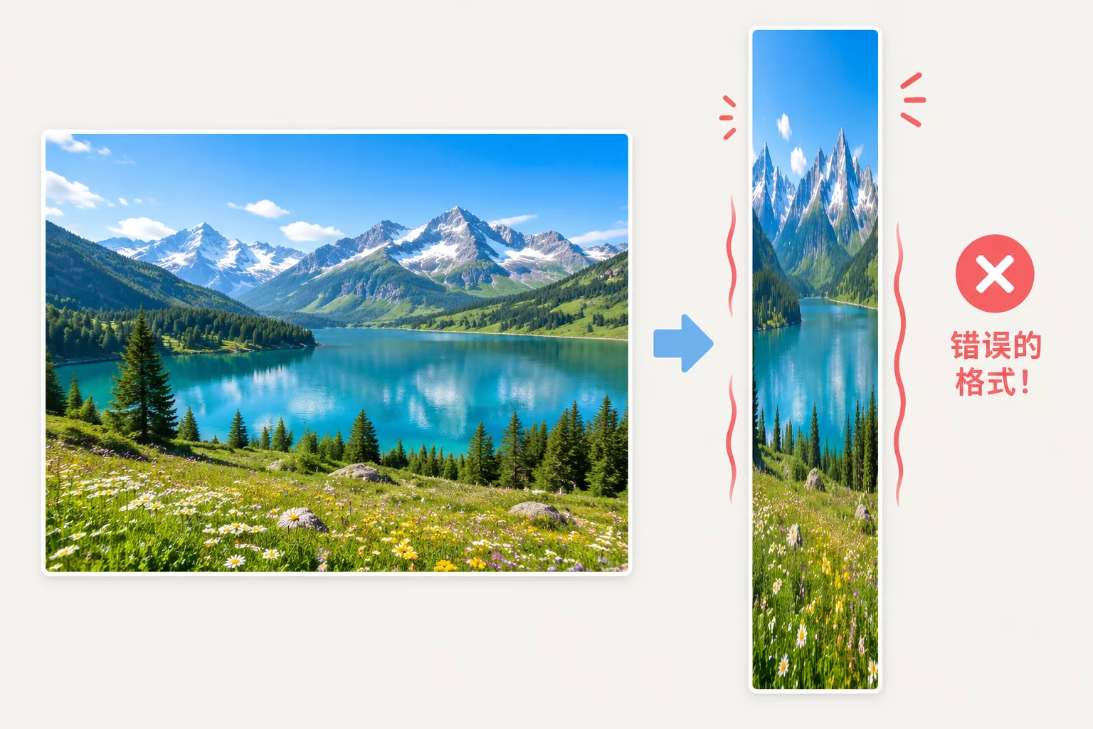 Visual Balance
What to do when primary assets fail in extreme ratios: modular framing, directional shifts, and supportive geometric grounding.
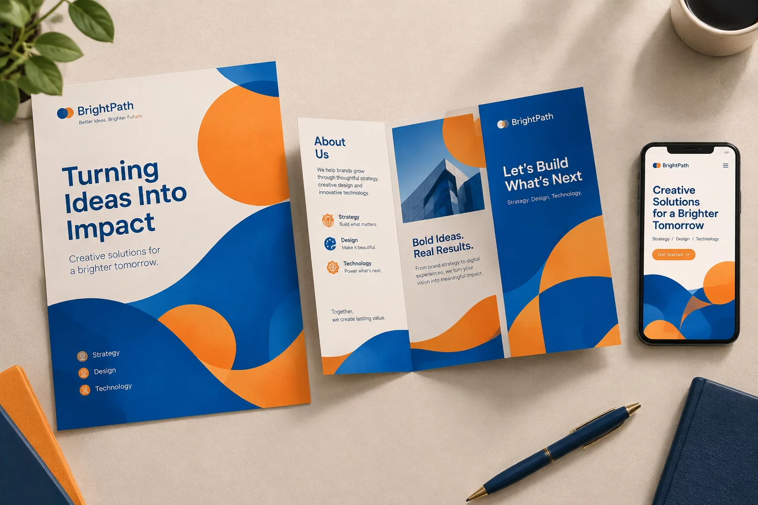 Brand System
Maintaining unified tone of voice and color dominance across fractured digital platforms and varied physical print collateral.
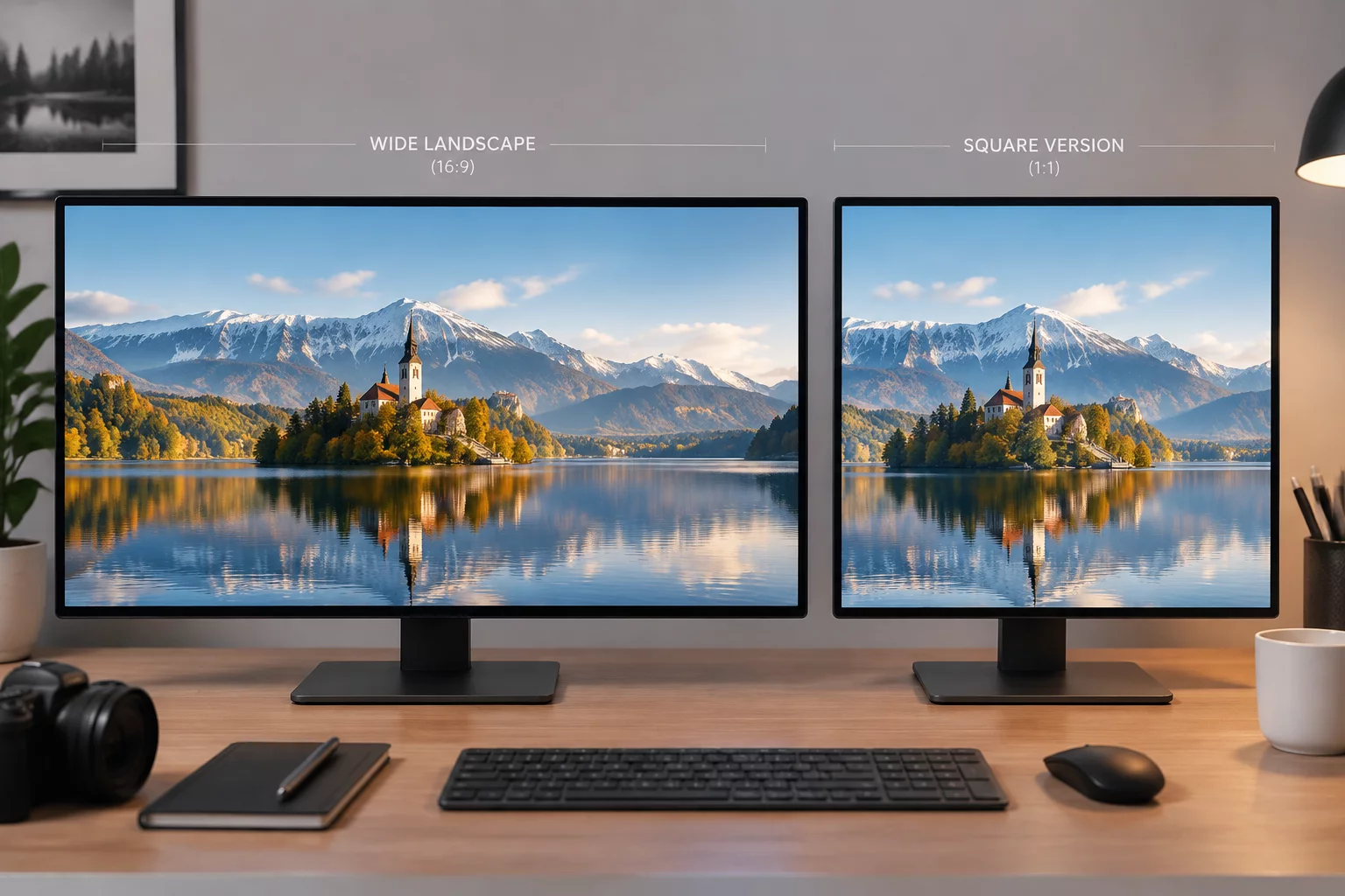 Square Ratio
Practical frameworks for rebalancing wide landscape graphics into symmetrical, focal-rich 1:1 feeds without awkward empty margins.
 Campaign Suite
The comprehensive guide to packaging design tokens, aspect ratios, and cross-channel specifications for seamless client handoffs.
We do not rely on automated generative filters or mechanical resizing algorithms. Every format relay guide is conceived, tested, and proofed by editorial art directors and graphic designers working on real print, web, and display constraints.

Every single layout transformation is manually broken down on calibrated proofing monitors before publishing step-by-step case studies.
Click each phase to inspect how our specialists evaluate and document format transitions.
Our layout directors dissect the primary master composition into essential semantic anchors (focal subject, headline hierarchy, secondary details), discarding redundant ornaments that collapse in small formats.
Font sizes, leading, and letter-spacing are systematically recalculated rather than scaled uniformly. We formulate exact relational ratios so typographic cadence retains authority across wide billboards and mobile squares.
Before an intensive or guide goes live, layouts undergo physical test prints and multiscreen browser rendering to confirm that rhythm and brand recognition remain intact under real-world viewing conditions.
Our educational programs and format translation blueprints are developed by experienced art directors and system designers who solve multi-format composition challenges every day.

Editorial Art Director & Format Strategist
12+ years directing multi-channel visual identity systems and modular campaigns for international cultural institutions.

Cross-Media Design Lead & Grid Architect
9 years translating complex print visual languages into resilient digital layouts and adaptive social feeds.

Typography & Scale Lead Specialist
8 years consulting independent studios on high-legibility optical sizing and typographic proportions in small-scale media.
Design teams, cultural curators, and independent publishers use our compositional relay framework to maintain visual integrity across mediums.
Every student, team member, and independent designer receives structured compositional feedback and technical support throughout their educational journey.
Our review tutors and technical mentors operate across global creative time zones to review your multi-format design submissions.
Clear deadlines for feedback, access inquiries, and compositional advice ensure your workflow stays uninterrupted.
Reach our mentor desk via dedicated email or schedule a detailed format adaptation review consultation with an educator.
To adapt your visual idea smoothly across multiple physical and digital mediums, we collect essential assets and compositional boundaries before launching the adaptation cycle.
Original vector files (.SVG, .EPS, or .AI) of logos, symbols, and graphic brand devices to prevent pixelation at billboard scales.
The complete list of required outputs with exact pixel or millimeter dimensions, DPI requirements, and intended viewing distances.
Finalized, proofread copy separated by priority tiers so we know what to prioritize in compact and expansive formats.
Original, full-frame photography or layered illustration files allowing flexible reframing without focal subject clipping.
Information about native UI overlaps on target platforms, header cutoffs, or physical binding margins to safeguard focal elements.
A designated decision-maker who approves composition reframing, layout balance iterations, and final pre-flight proofs.